Warped Plane
Wednesday, 27th September 2006 by Alex Turnbull
This passenger jet over Newark, California, has become very strangely warped.
I think this is something to do with the angles involved between the plane, the earth and the satellite, but trying to figure it out is making my head hurt! Can any of our loyal readers give us a decent explanation?
Thanks to Dawn Endico.
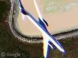
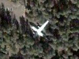
It must have something to do with the angle the photos are taken at. My guess is the plane was banking as the picture was taken, and that some local warping of the image was made by google, to get the tiles to fit.
For example an image taken at a lower altitude in teh sky would appear stretched. If the plane were closer to the lens, it may apear less stretched and so appeared MORE stretched after correction…
ok, i’m confused now
Some – most of? – of the high resolution aerial and satellite photos are taken with a so called “Pushbroom Scanner”. These devices capture a single scanline at a given time that is perpendicular to the motion of the sensor.
So, if something is moving during this process – like this airplane – it is distorted in a interesting way (it’s like “shear”).
Some further reading: http://www.ifp.uni-stuttgart.de/forschung/photo/push/push.en.html http://rst.gsfc.nasa.gov/Intro/Part2_22.html http://www.geo.ed.ac.uk/agidexe/term?427
It seems to make more sense if you look at the picture upside-down.
If you think about it, most of the pictures on Google Earth will not have been taken from directly above the place in question – the satellite can only be in one place. Therefore, almost all of the pictures are taken at an angle rather than perpendicular to the ground.
When the images are put back together, they then need to be warped slightly to get them all to fit together. This sort of warping is pretty clear in pictures of cities with tall buildings since, in theory, you should only be able to see the very top of the roofs of most buildings, whereas in fact you can often see the sides too. Sometimes on the join between tiles you can see that the buildings appear to be pointing in different directions.
Well, that’s what I think anyway.
Well, here’s what I think: At the time the picture was taken, the plain flew a curve. The sunlight reflected on the top of the plane, and that’s pretty much it. It looks kind of streched, but I think it just “lies” on the right side.
But that’s just my opinion.
I would agree with Markus. At least, that was the first thought i had, when i saw the thumbnail. But there wold be less shadow unless the sun was very deep (in the west).
This has never been put up here before? Weird. Found this ages ago. Anyway, does anyone who lives in San Fran know what those weird coloured fields are?
those aren’t fields, it is just water and i dont recall what they are for but its just water sectioned off, i think some kind of argriculture…
The ponds are of various salenities and have different uses… very wierd to see up close (I took a wrong turn and ended up on a road that went in between them). Some are salt ponds, others are “managed” ponds (see link).
http://www.sfei.org/presentations_posters/SOE_05/05SOE_modern_sideA_MedRes.pdf
It’s all part of the water pollution control system.
due to the color smearing on it, I’d bet that it was near the edge of the original source images… the optics near the edges of an image can distort like that… then the shape of the plane would get distored when you keystoned the image from the oblique angle it was probably taken at to map it onto the earth coordinates.
Another option is that if it was recorded with a pushbroom type sensor (not likely) then you would get visual scrunching of the aircraft like that due to the process… do a web search on slit-scan photograpy, and you’ll see similar things where movement of an object and the progression of time result in odd images. neat stuff.
but it’s most likely the former.
Wow…Something near San Francisco that actually leans to the right…
It’s probably just aliens: A UFO shape-shifting to appear like normal airliner.
13 comments in one afternoon, aren’t you popular!! 😉
Swamp gas. Weather Balloon. Venus.
Those are salt ponds:
http://ludb.clui.org/ex/i/CA3419/
The color is from algae, and varies with the salinity of the water. Fun fact: flamingos get their pink color by eating these algae and absorbing the pigment.
The San Francisco airport on the other side of the bay, and often planes circle around, such as if they arrive early. The angle the plane takes when turning can be pretty steep.
Wow thats a cool image…Google Earth has alot of gems to find and see.
My son was looking at this & found what he initially said was a shooting star when looking around the locality
The photograph was georeferenced to match the projected coordinate system they used for GoogleEarth. Looks like it was warped using 3rd polynomial.
The plane is fixing to land and is making the “final approach”
Nart, I love your explanation! Don’t believe a word of it of course, but still 😉
Yes, this is the salt ponds.
I recognized the location immediately because I often fly this rout. It has nothing to do with SFO.
The planes landing at San Jose Airport (SJC) makes their turns right here. If you are taking pictures from land you will see the airplanes tipped in a hard angle, and the photos will look like as if you took a picture flying right beside it. As to the blur, it could be a reflection of light and of course, movement.
Warp speed, Mister Sulu!
Could possibly be some kind of dopplar effect from the motion of the plane?
The transformation to correct imagery from photo -> real world coordinates is only for objects on the ground. Objects in the sky or above ground can have really wierd effects. The photo centre is also offset, the plane is at an odd angle and moving fast. So the plane is distorted.
The halo effect is common for objects on the edge of a lens – chromatic abberation.
RESOLVED!
OK, most of the explanations posted are interesting, but totally wrong (and many not even possible). Here’s the final conclusion:
Like Gergely Vass said, it was done with something like a pushbroom scanner type of technology. My very first video digitizer from way back in ’84 or so did this type of distortion on moving objects. Although, mine scanned from left to right from a video image coming in, taking 6 seconds for a single image to come through and if the target object was moving during the digitization, it would be warped.
Here’s the difinitive answer to the warped plane:
What it is NOT: 1. The plane is NOT banking. 2. The distortion has nothing to do with it being near the edge of the photo. 3. The distortion has nothing to do with it being higher than the ground beneath it. 4. The distortion has nothing to do with the angle of the satelite to the ground. 5. The doppler effect most definitely has nothing to do with it… that can only effect the wavelength (for light, that’d be color)… and for any moving object to have a noticable doppler effect with visible light, it’d have to be traveling at relativistic speeds (a large portion of the speed of light), which a plane moving slower than the speed of sound will most certainly NOT do. No object the size of a plane can be pushed to such speeds by current technology, and certainly not in our atmosphere or it would burn up and break apart and would be moving too fast to be captured in a photograph.
What it IS: 1. It is a side effect of: a. The motion and speed of the plane relative to the relatively fixed aiming of the camera to the ground. b. The slowness of the scanning process of the device capturing the image. c. The direction of the scan (top to bottom in this case). 2. The device that captured the image has some kind of a video camera. 3. The video image is captured one horizontal line at a time. 4. Each line that’s lower in the image is from a later point in time that the line above it. 5. While the image capture device was capturing horizontal lines for this image, the plane was moving down and to the right, resulting in each horizontal line showing the plane at a slightly different position further down and further to the right. 6. This resulted in an image with the image of the plane skewed in the horizontal direction it’s traveling (to the right from top to bottom of the image) and vertically (causing the plane to appear taller).
If the plane had been moving upward, it would have been squashed vertically, rather than stretched vertically. If the plane had been moving to the left, the horizontal skew would have been towards the left (from top to bottom) instead of to the right.
To prove this, I’ve done an incredibly simple image manipulation of loading the image into a simple page layout program (InkScape (free software from http://www.inkscape.org/) but just about any image manipulation software can do this). I then distorted the image by skewing the bottom towards the left. Then, I shortened the image vertically.
I’ve posted the final image here:
http://www.easiesttoremember.com/warped%20plane%20resolved.jpg
As you can clearly see, the plane is normal, but the distortion has been transfered to the background.
My skewing to the left compensated for the right to left movement of the plane in the timespan of the image capture. My vertical squishing compensated for the downward movement of the plane during the timespan of the image capture.
I hope this puts all the questions to rest. 🙂
As Gergely above says, this image was taken with a drift scan camera. The satellite drifts by overhead, and takes a single scan line at a time. This way it gets very long thin undistorted scans. You can replicate this by putting a picture of something in a flatbed scanner, and moving it to the side as the scan bar moves across it. The scanning does happen pretty fast (the speed of the satellite, many thousands of KPH), so only things that are moving relatively quickly get distorted.
This could also be a plane taking off from the Oakland Airport. The airport is due north and the runways run north-south. If they take off this way, they turn here to head east. If they use this end for thier approach, thus is where they make their final turn. I have seen several planes over San Jose in Google Maps that were approaching the San Jose Airport.
The Doppler Effect, when applied to astronomy (or photography here) is called “red shift” and “blue shift” due to the wavelengths moving toward and away from the observer. Note the red/blue colorations of the airplane. It, or the Google plane, or both must have been changing altitude when the image was taken.