Arboreal Typography
Wednesday, 26th October 2005 by Alex Turnbull
If you were going to use trees to graffiti the landscape with the name of your town, city, university or company... what font would you use?
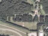
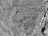
Arboreal sign-writers agree that uppercase lettering is a no-brainer, as legibility is obviously impaired due to the decrease in the letter size... Here in Bismarck, North Dakota, the typographer has decided on a Grotesque sans serif face, not dissimilar to URW Grotesk Extra Light Condensed, and has chosen to set it at 261,354 point (approx.)


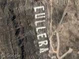
Over in Indiana, the Studebaker typographer has chosen a heavier typeface with tighter tracking, but a smaller size at only 216,850 point. Again the chosen face is a Grotesque sans serif, very similar (though not identical) to Franklin Gothic Heavy. What's most interesting is the way trees have grown since their initial planting in 1937, creating some really nicely distressed letterforms.

There's about 5,000 pine trees in the Studebaker sign, so just imagine how many make up the 2,592,000 point Luecke sign...
Thanks to Tim, Jason Signalness, Ryan J, Mark Donnell & aard.
About the author
Alex has decided that his title will be Senior Vice President of Stuff.
Postcript points eh?
That is really cool.
I first thought that it was some crazy thing in Germany referring to Bismarck in hte late 1800s
crack up – this post really made me laugh – I even checked your calculations before I realised you had the google convert links… d’oh! 🙂
Big deal. I have 40 acres covered in Wing Dings.
I take it the Studebaker thing is the car company. Are they still going? Is this test track still used? Where is the factory? So many questions! Does America still make cars? We used to make cars in Britain but someone decided it was a silly idea and we dont bother now and the thousands of car workers now work in DIY (hardware to our colonial friends) stores or are minimum wage security guards. (Ooh bit of politics – hope the Sightseer’s dont mind)
Northern Git, the Studebaker test track was the first controlled outdoor proving ground in the US, built in 1926. Whether it is still used or not I don’t know, but Studebaker left the automobile business in 1966…
More info on Studebaker at Wikipedia.
Just to the West of the track there seems to be several switch-backs cut into the woods, maybe a handling course?
View Placemark
Thare also appears to be a skid pad or two in the bottom left corner.
The ‘M’ and ‘A’ in ‘BISMARK’ are too different between the photo and the sample type. I think that there’s no actual font used to plant the trees.
I think it’s based off an actual typeface, but at a certain point they just winged it. It’s hard to replicate a font in 3-d, not to mention at such a large scale.
Oh and by the way, I’d definitely use DIN Medium (all caps) as the typeface for my town.
Close to hear on the Indiana/Michigan border is another sign similar to the Studebaker type. This one spells out ST PATRICKS, it is St. Patricks County Park.
View Placemark
ok I’m retarded, replace that “hear” with a “here”.
To answer a few previous posts: Northern git: Yes, this is (was) the Studebaker car company which stopped production in 1963. The Studebaker automobile was manufactured in South Bend, Indiana…about 12 miles east of the proving grounds. Check out http://www.studebakermuseum.org. The test track (2.5 mile oval) is still in use by the current owners (Bosch). DJ Swammi: Great observations!! The switchbacks were test lanes featuring mud, sand, cobblestone, water crossing and steep grade obstacles, plus ice and snow when in-season. And yes…skidpads too. Some of the course is still in use today..especially for heavy truck and bus testing.
I lived in Bismarck all my life and i never seen the “Bismarck”.
Studebaker went bust in 1966, but has been revived as Avanti Motors. Avanti originally built bespoke sports cars by that name from 1965-1991, and was then reborn from bankruptcy in 2001 to build Firebird-based and (currently) Mustang-based sports cars with the classic Avanti styling motifs.
Another company, Studebaker Motor Corporation, has a really badly-crafted web site, but they claim to be in some sort of an R&D phase on all-new Studebaker models that have nothing to do with Avanti Motors (Avanti having apparently sold off any interest in the Studebaker name and properties that they once held).
I was just looking for a picture of the Studebaker Trees originally, but there’s a history lesson for you, too!
I know that it was over two years ago that Studebaker was listed here, but it just got pointed out in http://jalopnik.com/cars/retro/studebaker-pines-still-standing-311514.php and has some kind of interesting information on the company.
Back in 1937, when Studebaker was still going strong (and 85 years old at the time, going back to their wagon-building days), the company planted 5,000 pine trees at their proving grounds outside South Bend, Indiana. 41 years after the final Stude- a Cruiser- rolled off the assembly line, the trees’ message is still visible from space.